Mathematics
In this section the two main modules for numerical Python (numpy) and visualization (matplotlib) are overviewed.
Numerical Python
Consider 2 vectors (implemented as lists), $a$ and $b$ that we would like to add. With the zip() function we can iterate two lists simultaneuously and hence obtain $a+b$:
>>> a = [1, 2, 3, 4]
>>> b = [9, 8, 7, 6]
>>> [sum(item) for item in zip(a, b)]
[10, 10, 10, 10]
Let’s analyse the time it takes to add two lists with with one million elements:
from random import randint

a = [randint(0, 100) for i in range(1000000)]
b = [randint(0, 100) for i in range(1000000)]
%time c = [sum(item) for item in zip(a, b)]
CPU times: user 141 ms, sys: 0 ns, total: 141 ms
Wall time: 141 ms
Let’s execute this same task with NumPy, the fundamental package for scientific computing,
import numpy as np

a = np.random.randint(0, 100, size=1000000)
b = np.random.randint(0, 100, size=1000000)
%time c = a + b
which makes stand out its performance
CPU times: user 3.62 ms, sys: 0 ns, total: 3.62 ms
Wall time: 3.64 ms
NumPy contains a powerful $n$-dimensional array structure, which allows efficient storage, manipulation and element-wise operations of vectors, matrices and higher-dimensional datasets. Moreover, it provides readable and efficient syntax. NumPy also supports many linear algebra capabilities such as
>>> A = np.array([[1,2,3], [4,5,6], [7,8,9]])
>>> A
array([[1, 2, 3],
       [4, 5, 6],
       [7, 8, 9]])
>>> A[:, 0]
array([1, 4, 7])
>>> A[0:2, 1:3]
array([[2, 3],
       [5, 6]])
>>> A.T
array([[1, 4, 7],
       [2, 5, 8],
       [3, 6, 9]])
>>> np.linalg.matrix_rank(A)
2
>>> np.linalg.eigvals(A)
array([ 1.61168440e+01, -1.11684397e+00, -1.30367773e-15])
# Note that due to precision errors, the last eigenvalue is 0.
>>> B = np.array([[1,1,1], [1,2,1], [0,1,2]])
>>> np.dot(A, B)
array([[ 3,  8,  9],
       [ 9, 20, 21],
       [15, 32, 33]])
Visualization
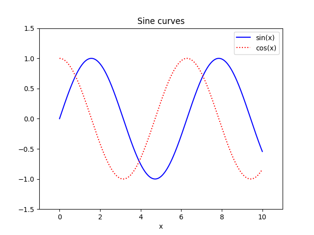
Matplotlib is one of the most popular scientific visualization packages. Its documentation offers many examples which we encourage you to take a look at. For instance, find below a representation of $\sin(x)$ and $\cos(x)$ for $x \in [0, 10]$:
import matplotlib.pyplot as plt
import numpy as np

x = np.linspace(0, 10, 1000)
# x is an array of 1000 evenly spaced numbers over the interval [0, 10]

plt.plot(x, np.sin(x), '-b', label='sin(x)')
plt.plot(x, np.cos(x), ':r', label='cos(x)')

plt.title('Sine curves')
plt.xlabel('x')
plt.xlim(-1, 11)
plt.legend()
plt.ylim(-1.5, 1.5)
- Note: If you are working with Jupyter notebooks you need to execute the command
%matplotlib notebookfor interactive plots or%matplotlib inlinefor static images of your plot.
The following example is an illustration on displaying data downloaded from the Internet.
The National Oceanic and Atmospheric Administration is an American scientific agency that focuses on supplying environmental information. For instance, this piece of code downloads a json file with surface temperature anomalies with respect to the 20th century average.
import json
import urllib.request

response = urllib.request.urlopen('https://www.ncdc.noaa.gov/cag/global/time-series/globe/land_ocean/1/12/1880-2018.json')
temperatures = json.load(response)
If we now take a look at the content of temperatures we will obtain the following dictionary:
{
    "description": {
        "title": "Global Land and Ocean Temperature Anomalies, December",
        "units": "Degrees Celsius",
        "base_period": "1901-2000",
        "missing": -999
    },
    "data": {
        "1881": "-0.06",
        "1882": "-0.18",
        "1883": "-0.09",
        "1884": "-0.16",
        /* ... */
        "2015": "1.13",
        "2016": "0.81",
        "2017": "0.82",
        "2018": "0.86"
    }
}
In order to plot a histogram we can use the bar() function from matplotlib.pyplot module:
import matplotlib.pyplot as plt

# Convert temperature from string to float
data = {k : float(v) for k, v in temperatures['data'].items()}

# Convert years and anomalies into a list
years = list(data.keys())
anomalies = list(data.values())

# Commands to plot the histogram
plt.title('Global Land and Ocean Temperature Anomalies')
plt.ylabel('Anomaly (ºC)')
# Plot a bar for each year
bars = plt.bar(range(len(years)), anomalies, color='green')
# Add a marker every 10 years
plt.xticks(range(0, len(years), 10), years[::10], rotation=90)
# Change color for 'hot' years
for i, bar in enumerate(bars):
    if anomalies[i] > 0:
        bar.set_color('red')

plt.show()
You can download the full program here and the output is the following:

 Lliçons.jutge.org
Víctor Adell
Universitat Politècnica de Catalunya, 2023
Prohibit copiar. Tots els drets reservats.
No copy allowed. All rights reserved.